
Project Info
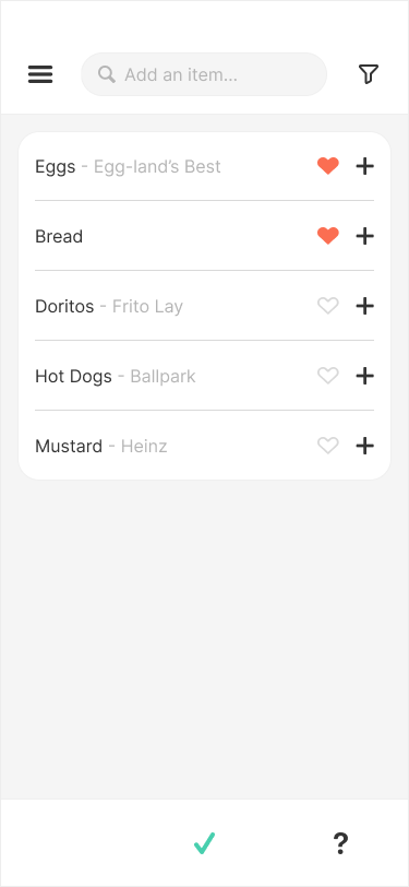
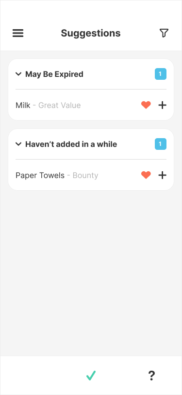
GroceryGo is a startup company seeking to create a smart grocery list app that goes above and beyond standard grocery lists by utilizing AI to give suggestions and insights into items it knows you will need soon, while also connecting with grocery stores' APIs allowing you to send your lists as an order to be fulfilled and picked up.
The app needed to have the functionality of the advanced technology, but designed in a way that was classical and intuitive so that any user could pick it up and begin using it with little to no instruction.
(( Please click the images to see higher resolution versions ))

The Research
The scale of this project was much larger than other projects I've worked on in the past, so it was important for my research to be well organized and thorough before continuing on to the design phase. However, with only 1 week allocated for research I had to reduce the overall scope and focus to specific areas to gain quality information in a limited timeframe.
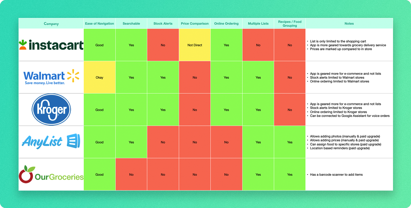
Competitors
Since most competitors are either focused on creating lists or e-commerce apps only, I wanted to gather competitors from both areas to ensure the app would have a good balance.
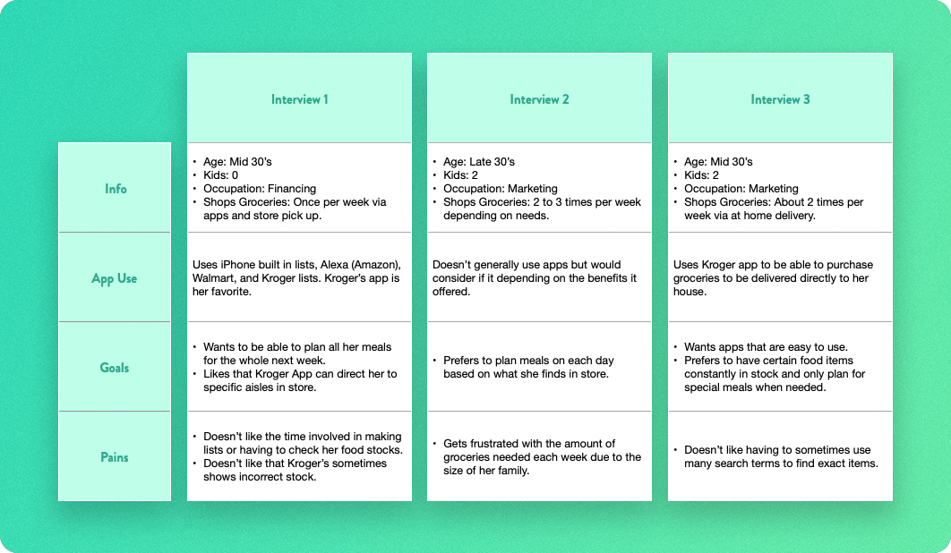
Interviews
I was only able to utilize the help of 3 interview participants within my timeframe. Luckily there was a good variety of grocery shopping styles and app usage, so I was able to garner some very useful data.
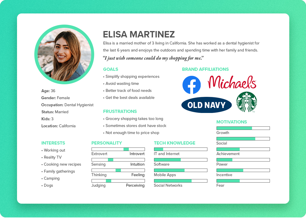
Persona
Using my interview subjects as a basis I created a persona that was a blend of all 3. Ideally I would have liked to have more interview participants to better define the persona but Elisa is still a strong contender for our primary user.

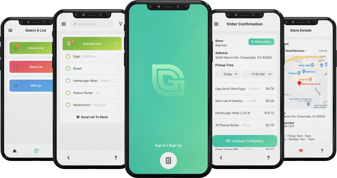
The Design
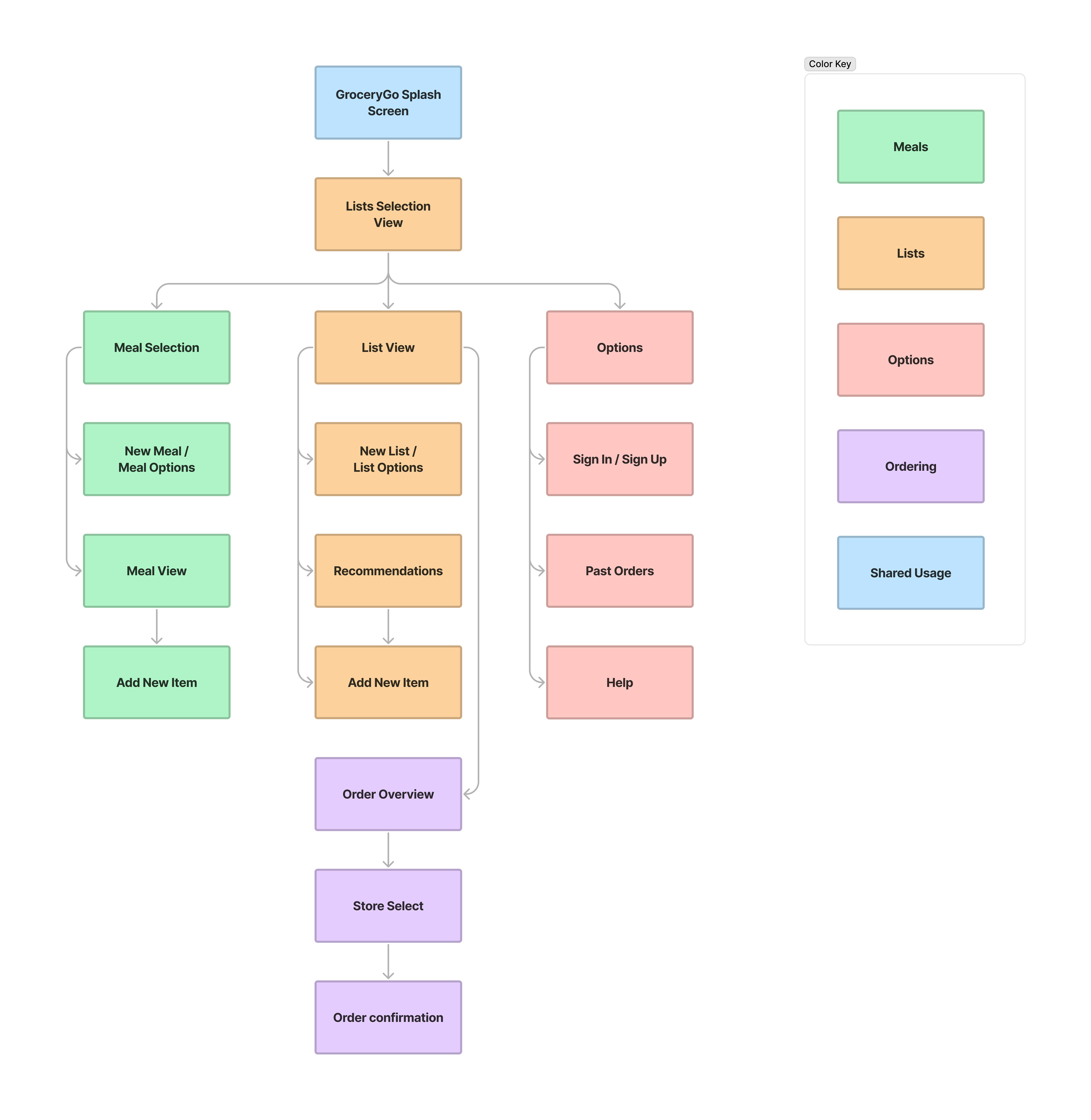
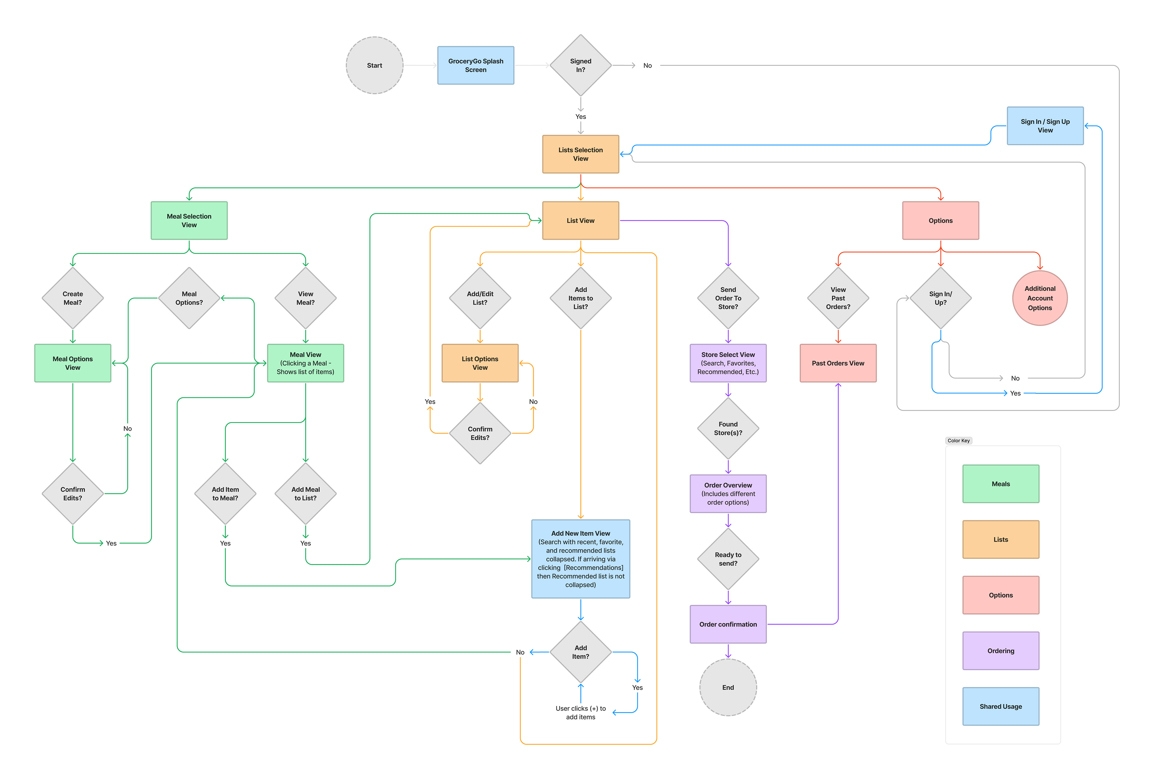
This was one of the most complex projects that I've worked on so far so it was extra crucial to make sure everything was planned out thoroughly before beginning sketching out ideas for the actual app. I created a site map as well as an intricate user flow chart in order to define what screens were needed and how they would connect.
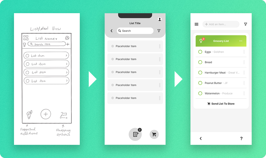
Once I had my user flows and site map in hand, I began sketching out my initial ideas for how the app would look and feel. Through the process of taking the idea from sketches to high fidelity wireframes certain issues with usability and flow arose that required rethinking the layout and structure of the app. In the end, though, it came out looking and feeling fantastic.

Testing & Iteration
Having a good design that is visually appealing is always nice but if it doesn't work for the user then it's not really a good design. To make sure the app was intuitive and accessible I found 3 participants that closely resembled my persona and ran them through some testing to validate aspects of the app design and the assumptions I made.
User Testing
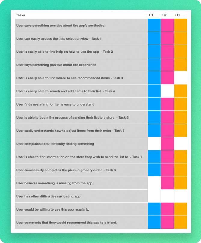
Due to the large scale of the project I had my participants run through 8 different tasks to help track down potential issues. There was definitely need for testing in other areas of the app, but time was short and I didn't want to overwhelm my participants who were all volunteering to help me.
Despite not getting to test every aspect of the app I was able to gather some very useful information as well as some great suggestions.
The most notable takeaways were:
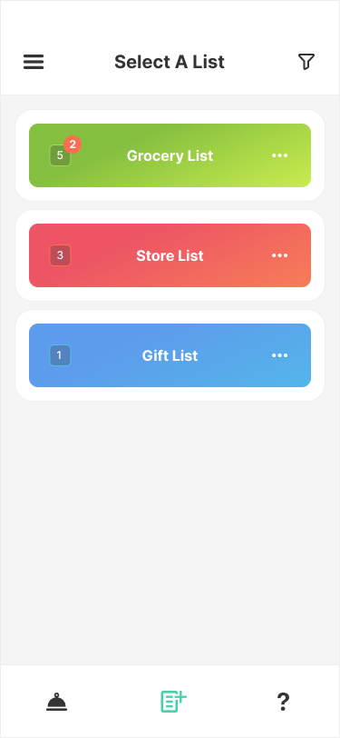
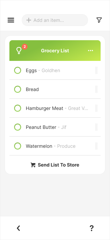
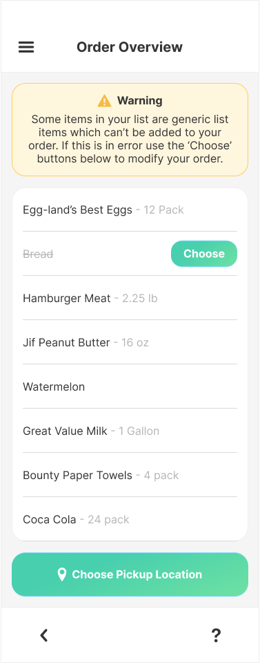
· One participant struggled slightly on where to find the recommended items. To address this I added an alert bubble to the List Selection View as well as its original placement inside the actual List View.
· Another user had minor issue finding how to add items to their list. This was primarily a limitation in Figma although I was able to change an icon to help better define the intended usage in the Add Item View.
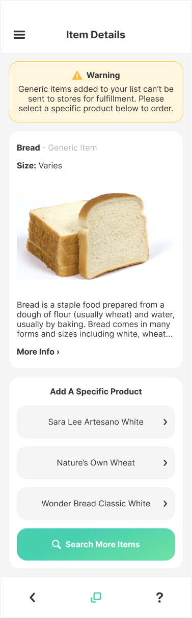
· The suggestions included adding features like shared lists, notification settings, and removing an unnecessary modal from the item details page. Although, since some of these were outside the original scope of the project I was only able to accommodate the removal of the modal.

Challenges
Time is always a challenge with projects and this one was no exception. The entirety of the project was due in 4 weeks and I may have been too ambitious with my overall vision for the project and the amount of complexity it involved.
Aside from the time constraints another major challenge was defining the product itself . When generating a new idea that isn't already a well defined product it's easy to let your imagination run wild. Certain ideas might be hard to explain to others, and some features you originally anticipate including may turn out unfeasible or require a great deal more pre-planning than expected.
Lastly, when going from initial sketch to final wireframes I found many of my original ideas for layout and placement weren't ideal and in some cases more of a hinderance. I believe with more research, and more time to plan, these may have been addressed earlier on. Although, it is possible this was just part of the challenges in creating a new type of app. It's also possible that it's just something that comes with experience which I definitely gained during this project.
final Thoughts
For this project I really wanted to stretch my abilities and build a more complex and in depth product than I have before, and I believe I have achieved that. Of course, there are things I would do differently with the knowledge I have gained, but the final product came out, in many ways, better than I originally anticipated. It was a fun, yet challenging project, and the experience I've gained will surely prove to be extremely valuable in my future project endeavors.
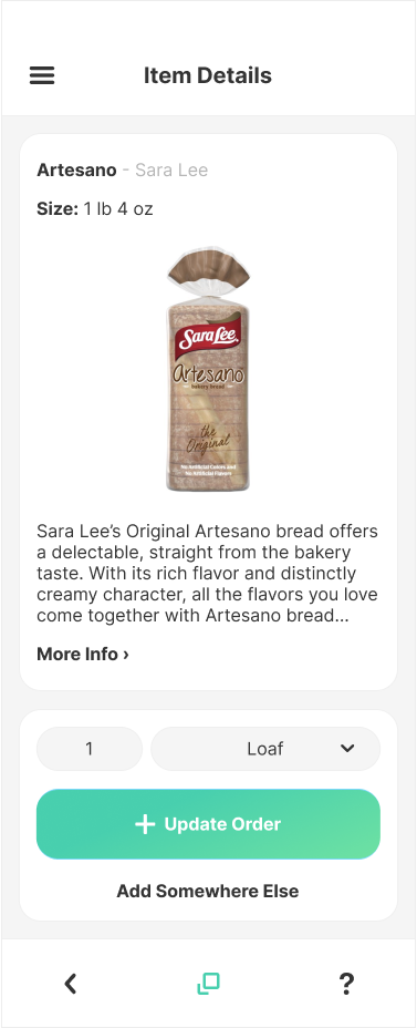
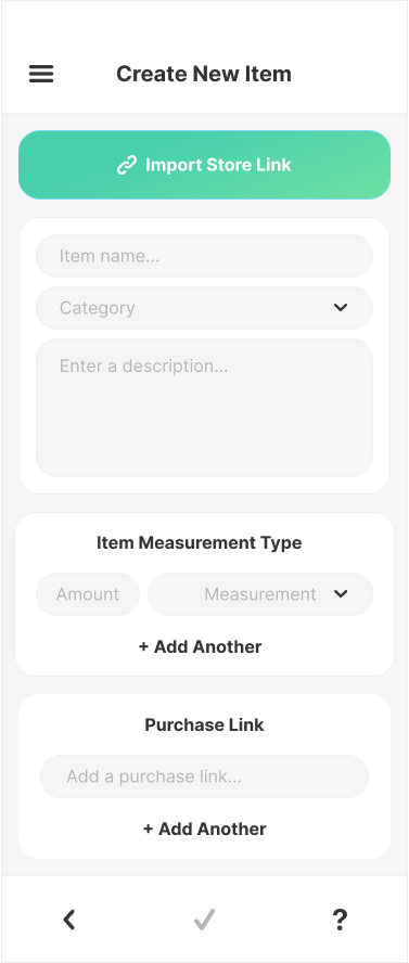
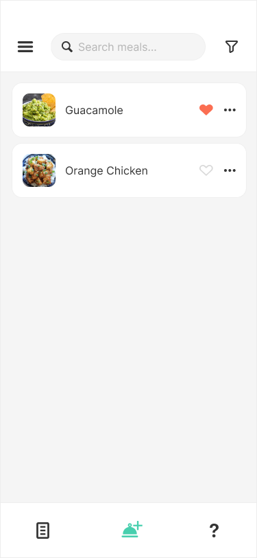
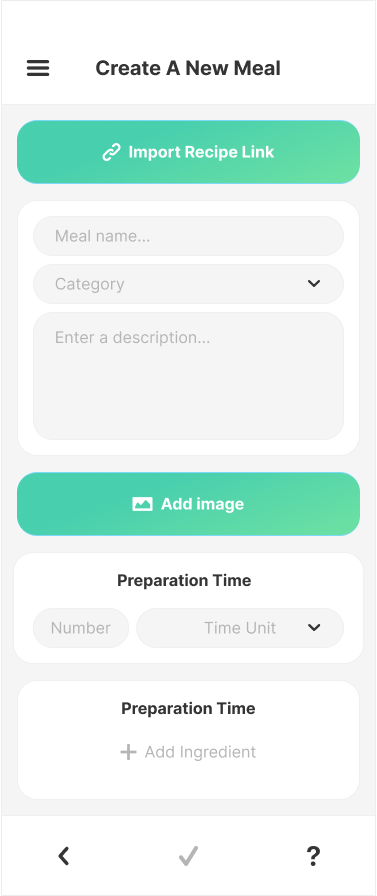
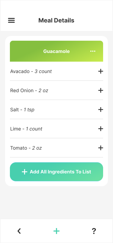
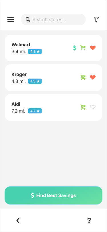
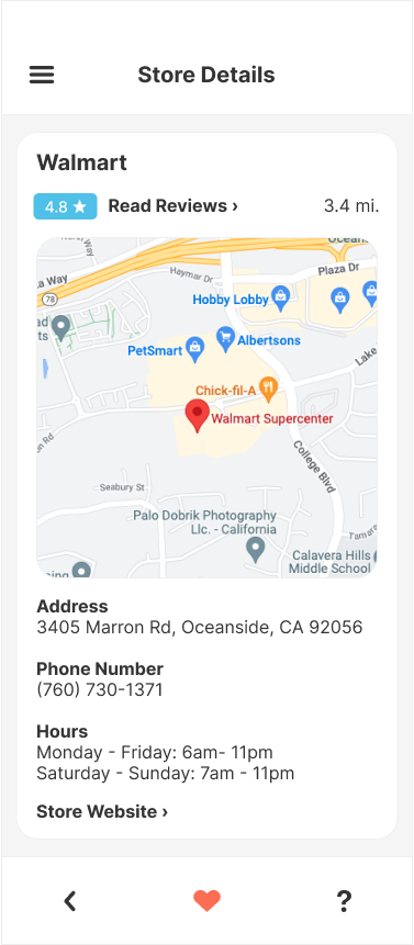
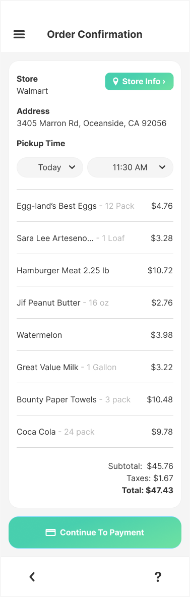
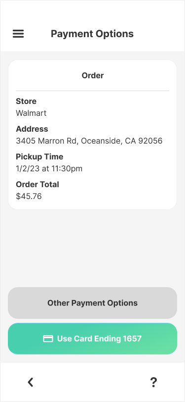
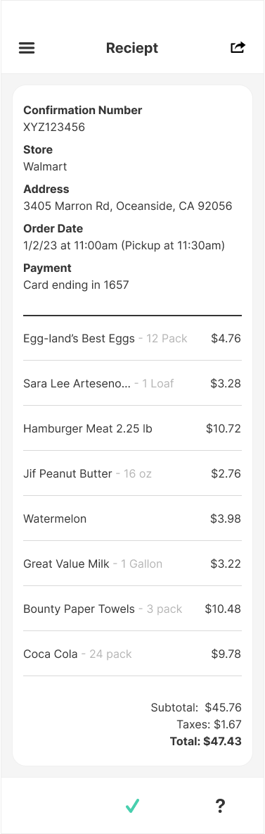
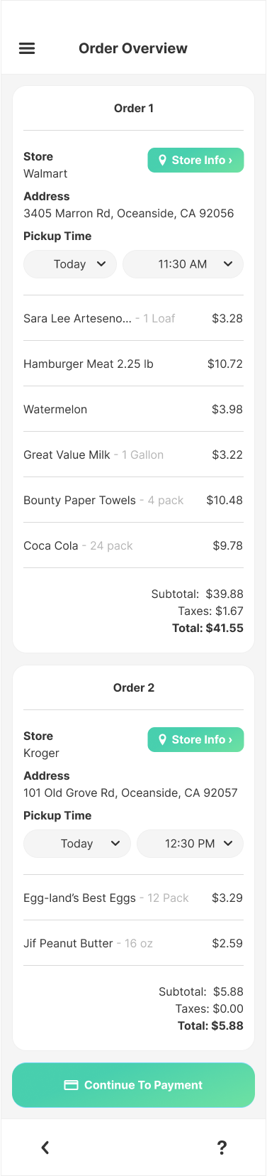
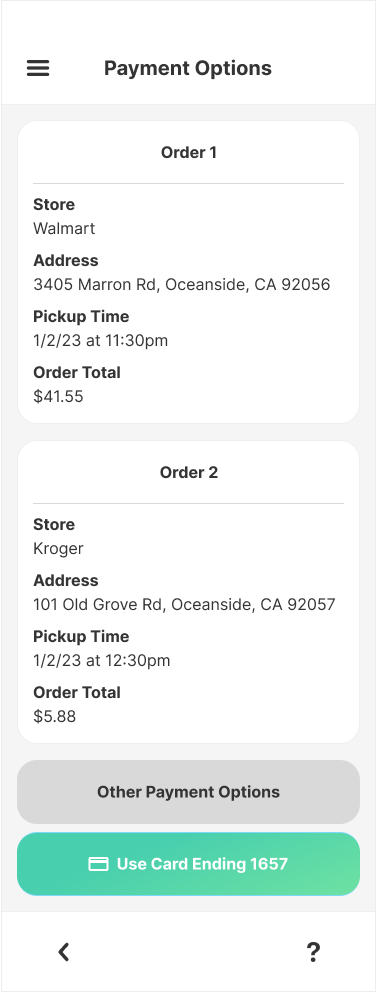
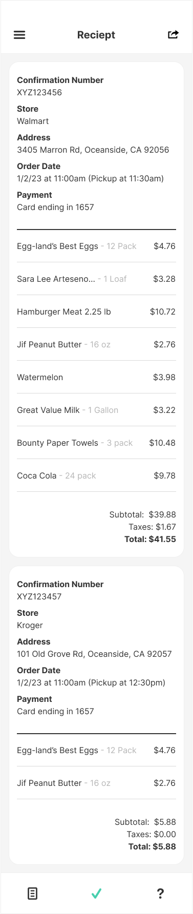
final Product
Thank you for viewing this project. If you have any questions please feel free to reach out via the contact form above.